If you think the way your documents look doesn’t matter, think again.
From welcome packs and information sheets to intake forms and reports, your printed (or downloadable) documents do more than deliver information. They communicate trust. They reflect how seriously you take your business and how much effort you’ve put into thinking about your clients.
I’m going to break down:
Why branded documents make a difference
How they help build trust and credibility
Simple upgrades to make your documents feel polished and professional
Why good design can improve client engagement and conversion
First impressions aren’t just digital
We talk a lot about logos, websites, and content, but what about the real-world stuff?
For many businesses, especially in education, therapy, training, or community settings the first client interaction often involves a printed or emailed document:
A referral form
A registration pack
A terms of service document
A “what to expect” information sheet
If that document looks like it was banged together in Word in 2007 (shoutout to Times New Roman, curvy word art and alllllll the clip art), it undermines the professionalism you’ve worked so hard to build. Not that I have a thing against Word, it’s a great tool! As with anything, it’s how you use it that matters.
Branding = trust, even on paper
Professionally branded documents show that:
You’ve taken time to think about client experience
You care about clarity and consistency
You’re not just winging it
And that builds trust, which is essential, especially in sectors where clients are sharing personal information or investing emotionally in a service, like therapy, education, or coaching, but also in sectors where clients rely on your judgement and care, like health and safety, aesthetics, or consultancy.
Even simple tweaks like consistent colours, a branded header, and logical structure can help someone feel more comfortable engaging with your business.
Branded docs boost conversion (and reduce admin hassle)
When documents are well-designed:
People are more likely to read and understand them
They’ll fill them in correctly the first time
They’ll feel reassured about the process (less follow-up = less time wasted for you)
They’re more likely to take the next step – booking, signing, or showing up
In short, a clean, branded document can mean:
✅ Fewer questions
✅ Less chasing
✅ More confidence in your business
That’s a win for everyone.
What makes a document “professionally branded”?
You don’t need to be a graphic designer to get this right, but you do need to go beyond plain black-and-white, default margins, and centre-aligned bold headers.
A professional branded document will typically include:
Your logo (in a consistent place)
Your brand colours and fonts (ideally used sparingly but consistently)
Structured headings and subheadings
Icons or graphics for clarity (especially in info-heavy docs)
Contact info or footer branding
Tone of voice that matches your brand (calm, clear, approachable, whatever fits you)
Whether it’s a PDF someone downloads or a printout they’re handed at a consultation, it should feel like it belongs to your business and not something generic or borrowed.
Common documents that benefit from a brand refresh
Here are just a few examples of where a quick revamp can make a big impact:
Welcome/information packs
Intake forms or referral forms
Evaluation or progress reports
Consent forms
Client handouts or resource guides
Workshop packs or training booklets
Terms and conditions documents
Feedback/testimonial forms
If you’ve got any of these lying around in an old folder somewhere, it might be time to give them a little love.
It’s not about being “fancy”, it’s about being clear
Some people avoid branding their documents because they don’t want them to feel overly corporate or flashy.
But this isn’t about style over substance, it’s about making documents easier to read and trust. Clear fonts, logical layout, friendly language, and tidy branding can make even a dense policy document feel more human and digestible.
Don’t forget accessibility
Good branding doesn’t mean style over function.
If your clients include neurodivergent individuals, those with visual impairments, or people who just don’t want to wade through walls of text, then thoughtful formatting becomes essential.
Things like:
Plenty of white space
Clear headings
Bullet points
Avoiding tiny font sizes
Descriptive titles and meaningful file names
All help your documents do their job better for more people.
Want help creating documents that reflect your business?
If your current forms and packs feel clunky, inconsistent, or just a bit blah, I can help.
I work with small businesses and organisations to create branded templates and documents that are easy to use, easy to update, and reflect who you are.
Whether you want one branded referral form or a full pack, I’m happy to chat.
There’s a couple more past examples here: Drowning in Admin?
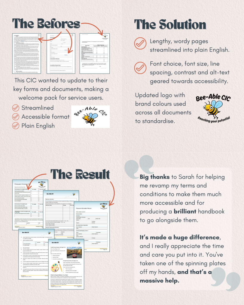
And here’s what one recent client had to say,
“Big thanks to Sarah for helping me revamp my terms and conditions, to make them much more accessible and for producing a brilliant handbook to go alongside them.
It’s made a huge difference, and I really appreciate the time and care you put into it. You’ve taken one of the spinning plates off my hands, and that’s a massive help.”